-
Just what is a book, anymore, anyway?
Craig Mod -
Combined into a word, a series of letters can be
Willi Kunz
very powerful, more precise than a picture. -
I am interested in
Tibor Kalman
imperfections, quirkiness, insanity, unpredictability. -
I try not have a style, although I have one!
Sara De Bondt
That’s why ccoollllaabboorraattiioonn is important. -
I’ have always been interested in attracting attention
Ruth Ansel
to the page then bringing attention to myself. -
Most big books are crapppp.
Stefan Sagmeister
2014 conference is ended! Thanks to all the participants
For info about upcoming event, check out our main page!

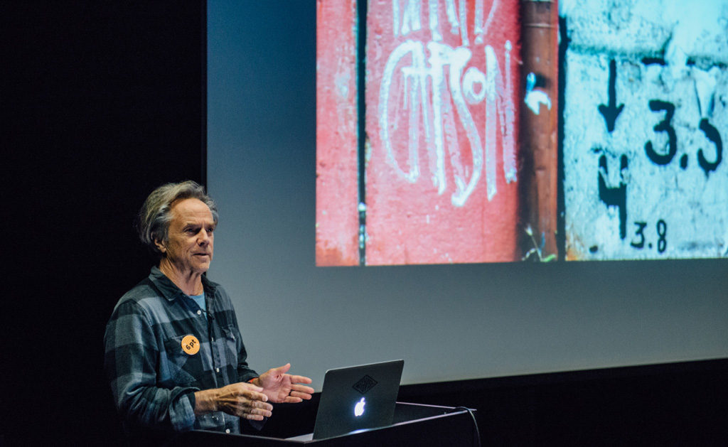
David Carson US
Never snap to guides
David will show and talk about his recent work, along with a few photographs and some of his well known earlier work.
David Carson (United States of America)
D. Carson is considered as the most influential book designer of our times. His creation for the magazine “Beach Culture” has gained “Best Overall Design” and “Cover of the Year” awards. D. Carson is an author of 4 innovative and experimental books: “The End of Print: The Graphic Design of David Carson”, “2nd Sight”, “Fotografiks”, “Trek”. Peaces of work presented in these books are still showed to the public in various exhibitions around the world.
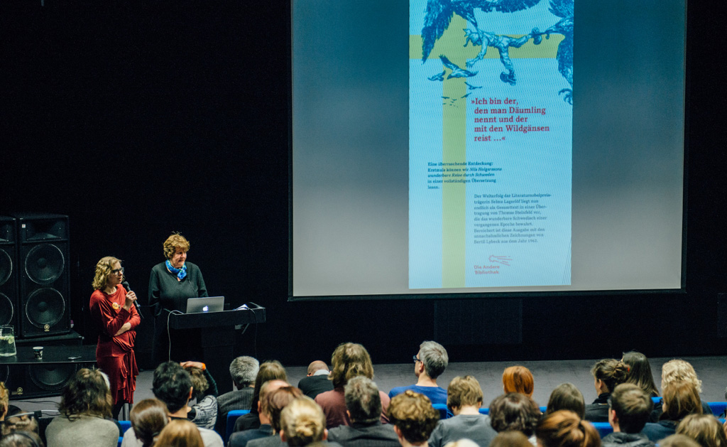
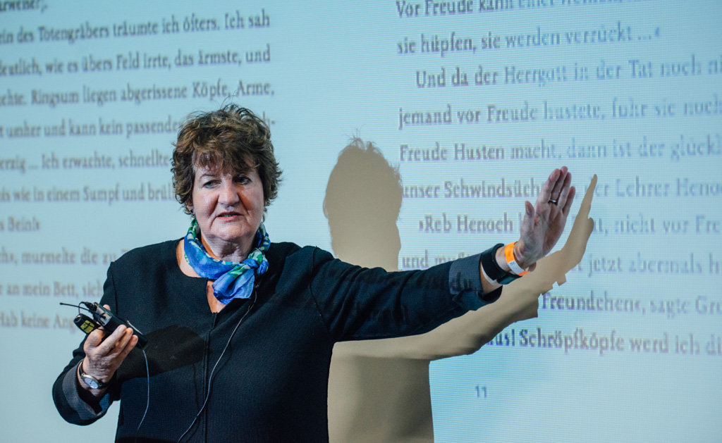
Renate Stefan DE
“Die Andere Bibliothek”
The 1rst editions of the Die Andere Bibliothek. 1 title every month ... since 1985. Designed by the most famous international book-designers.
Renate Stefan (Germany)
Production manager at “Aufbau” publishing group, initiator and publishing manager of the book series “Die Andere Bibliothek”, jury member of an international contest on bookmaking “Stiftung Buchkunst”.
Roland Stieger CH
From inside out
How to go beyond the borders of design in a book.
Roland Stieger (Switzerland)
Apprenticeship as a typesetter 1986-90, post grade degree as a typographic designer under guidance of Jost Hochuli. Since 1993 co-partner of tgg.ch. 2008 to 2010 CAS Type Design at the ZHDK under the guidance of Hansjürg Hunziker and André Baldinger. 2014 founding of abclitera.ch together with Jost Hochuli and Jonas Niedermann. The work of TGG has won several awards as The most beautiful Swiss book designs, Type Directors Club New York, Art Directors Club New York, Red Dot Award, iF Communications Award, European Design Award, Joseph Binder Award.
Kęstutis Vasiliūnas LT
Artists Book Structures
Artists Book – an interesting phenomena in terms of its interdisciplinary, vagueness, all-taken-into-account variety and very evident criteria at the same time.
prof. Kęstutis Vasiliūnas (Lithuania)
Lecturer at the Department of Graphics at Vilnius Academy of Arts, curator of international events of book art, member of Lithuanian Artists Association, “Europe 24” and “Scandinavia-Baltic Group” artists groups.
Tom Mrazauskas LT|DE
Fiasco
“Writings about the origins of fiasco are full of subtle conjecture, misunderstandings and downright ignorant assertions, but everyone who tackles the subject ends by saying sadly that the problem is insoluble. This includes me: be warned that I shall come to no very definite conclusion.”
Tom Mrazauskas (Lithuania | Germany)
Tom Mrazauskas began learning graphic design by himself in 2003 and designed his first book in 2008. Since 2012 he is living in Berlin, working with publishers both in Germany and Lithuania. Tom has gained awards in international book design contests (The Best German Book Design, Frankfurt 2014; Best Book Design from all over the World, Leipzig 2013), gave a talk at international design conference TypoBerlin (2014).

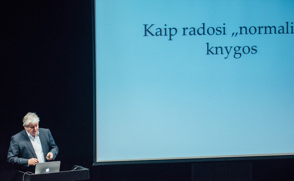
Saulius Žukas LT
How “normal” books came into being
Several fun novels on Lithuanian book design creation.
dr. Saulius Žukas (Lithuania)
Literary critic, lecturer, founder of publishers “Baltos lankos”.
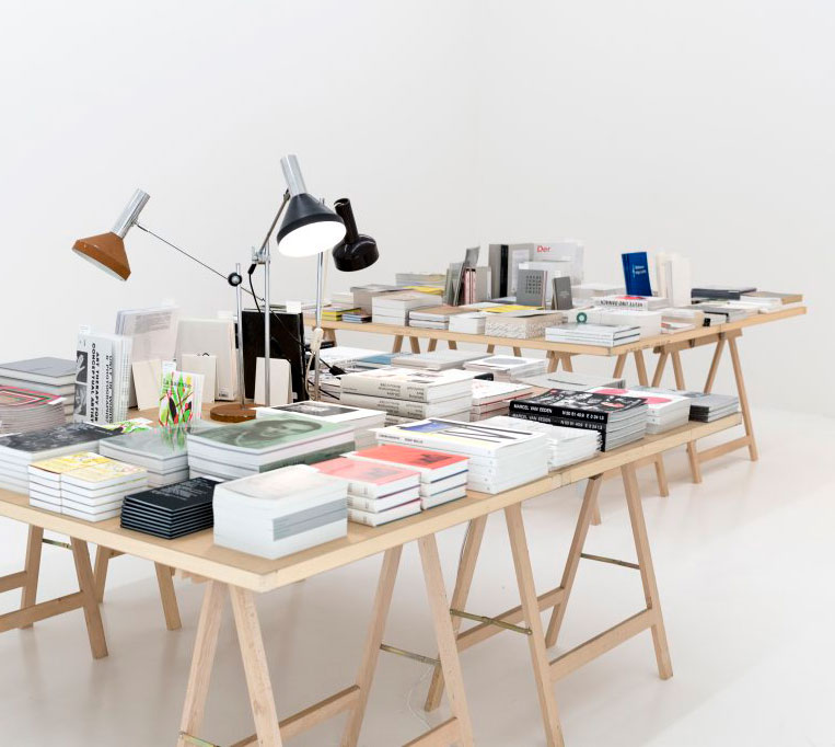
The Most Beautiful Swiss Books 2013
The most beautiful Swiss books of 2013 are presented in the exhibition together with the “Golden Letter” award winner of “Best Book Design from all over the World 2103” annual world competition — the book “Merret Oppenheim. Worte nicht in giftige Buchstaben einwickeln”.
Since 1943 “The Most Beautiful Swiss Books” contest is organized by Swiss Culture Council, which is responsible for the quality and dissemination of book design in Switzerland. International jury decides on the most beautiful books of 400 submitted for the contest every year, evaluating concept of the book, graphic design, print and especially innovativeness and originality. In the framework of the contest an annual exhibition of the nominated books are organized and the catalog released. The contest supports the maintenance of historical memory and traditions, at the same time fostering the develoment and creation of new trends of bookmaking. It is one of the most significant bookmaking contests in Europe.
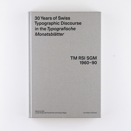
30 Years of Swiss Typographic Discourse
A research project initiated by a student at the École cantonale d'art de Lausanne (ECAL) traces the development of the trade journal ‘Typografische Monatsblätter' (TM) over three decades. In addition to an online archive, a large-format, substantial volume with a hardcover was published. It starts with a series of double-page photos, in each of which several covers of TM by a single designer are arranged into groups. The main section, in lavishly illustrated chapters, takes the reader through the journal's eventful history, from the apogee of Swiss design to the rise of the computer, and provides glimpses of numerous double-page spreads and individual pages of the journal. The layout is based on a strict grid and is very repetitive, and attention is thus focused on the materials being illustrated. Some of these look surprisingly fresh, so the book does not seem merely historical. The research involved is impressive and the volume will undoubtedly serve as an important reference work in the future.
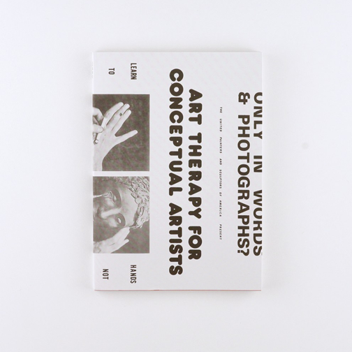
Art Therapy for Conceptual Artists
An art book by the American artist Neke Carson dating from 1972, containing instructions for making five ‘works of art' out of papier mâché, wood, plasticine, etc., has been reissued as a paperback. The five chapters each start with a full-page instructional text in a typewriter font, followed by a series of photos - each placed singly on the recto page - illustrating the work process. A reprint of an advertising poster for the book serves as a dust jacket, and a photograph of the original edition appears on the book's front cover. The relationship to the original is thus very well presented and the reproduction is otherwise befitting. The book has a contemporary appearance, is slightly mysterious, and the original is in no way fetishized. The amusing material is a historic find, and the question of the future of art that was raised on the poster can be raised once again, forty years later.
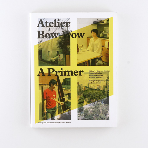
Atelier Bow-Wow
A large-format catalogue with a softcover and dust jacket was published to accompany an exhibition in Zurich by the two Japanese architects who founded the architectural office Atelier Bow-Wow. Their projects are presented in chronological order, most typically accompanied by one large photo and a drawing (at times on fold-out pages). Also in chronological order are two- to four-page chapters on the theoretical concepts that were important to Atelier Bow-Wow at specific times. These chapters consist of essays running across the pages in a wide column and large type, accompanied by a wide variety of textual and pictorial references as well as links to the projects and to other concepts. At the very back there is a picture section with new photos of the buildings - in their present-day surroundings and at times with their inhabitants - arranged in an irregular layout with plenty of white space. The generous presentation makes the complex work very accessible. The content and design of the various components interact optimally and everything is relaxed, warm and entertaining.
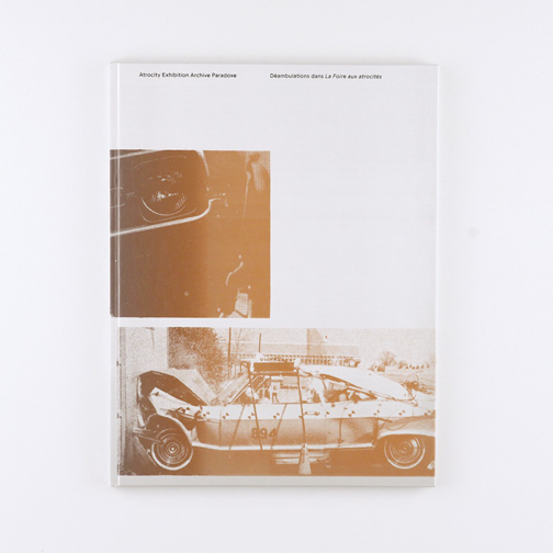
Atrocity Exhibition Archive Paradoxe
A research project at the École cantonale d'art de Lausanne (ECAL) explored in two exhibitions the context and influence of James Graham Ballard's scandalous narrative experiment ‘The Atrocity Exhibition' (1970). This large-format, slim hardcover volume contains five essays that alternate with three sections of mostly full-page pictures from the exhibitions and from an archive of 1960s pulp magazines. Each pictorial section is printed in a different colour mixed 50 per cent with a silver tone. An additional ‘colour' - of 10 per cent silver and 90 per cent varnish - was manually applied to the plates during printing, so that the pages are covered with irregular transparent patches that differ slightly in each copy. The result is a fine and attractive book-object that also creates a mysterious impression with its various enigmatic images and slightly manipulated type. The intervention in the printing process recalls Ballard's thoughts about synthesizing humans and machines.
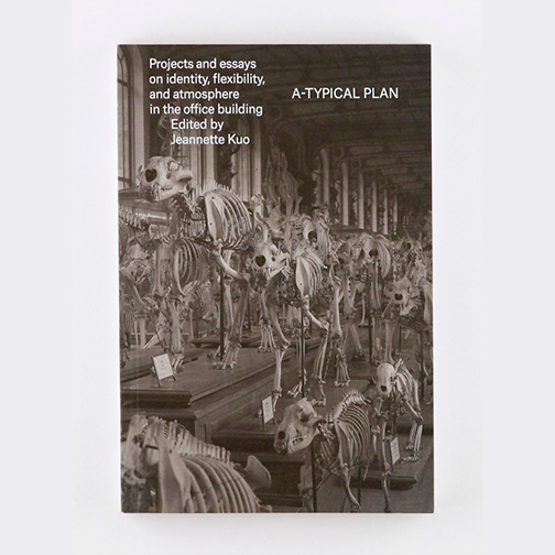
A-TYPICAL PLAN
A black-and-white volume with a softcover and flaps from Jeanette Kuo's studio at the École polytechnique fédérale de Lausanne (EPFL) explores the architecture of open-plan offices. In the first part of the volume, 20 well-known examples are presented in a few plan drawings and the occasional photo (always one per page). The second part, entitled ‘Strategies', presents numerous drawings of structural elements on fold-out pages, representing different conceptual approaches to the organization of open-plan offices. This is followed first by an illustrated section with essays and finally by a portfolio of ten student projects. The various parts and visual elements are approached in a discrete and optimal fashion. Everything seems simple, clear and generous, and as the book opens easily it invites extensive study. Though the cover photo does not represent the contents, it does show a certain degree of self-irony.
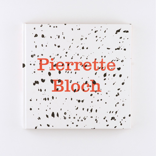
Pierrette Bloch
An extensive catalogue in an unusually narrow landscape format presents works by the French painter Pierrette Bloch (b. 1928) dating from the 1950s to the 1980s. Between six essays with black-and-white illustrations, four long series of works are shown in which each painting appears alone on a single page or on a double-page spread. Pierrette Bloch worked with repetitive points and overlapping lines, often in monochrome black, and at times with red or greyish-brown tones. The book's design responds subtly to various aspects of her work : its format suggests her varying landscape formats ; the title in red type and the dense black font with pronounced curves used throughout the book take up her preferred colours and oft-used points ; and the slightly old-fashioned overall impression, to which the paper also contributes, situates the works in the period in which they were created. The layouts and typography appear conventional at first sight but include a few jarring details that contribute to the book's attractiveness.
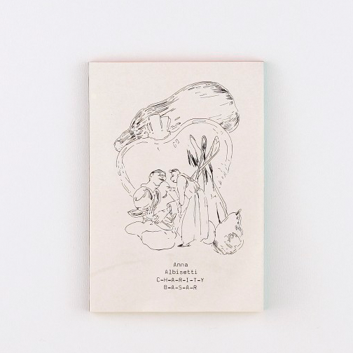
Charity Basar
The small-format self-published volume presents on the recto pages 50 delicate black-and-white drawings depicting enchanted forest and hiking scenes. There is no jacket, but noticeable at first glance are the brown adhesive binding and coloured edges, which are yellow, red and green on one side each. Two thin papers in a practically identical light tone alternate at irregular intervals. A typewriter font reproduced in black at the original size is used for the small amount of text included - title page, foreword, afterword and credits. The execution is very harmonious in all its details and the economic use of the selected materials creates an almost auratic effect.

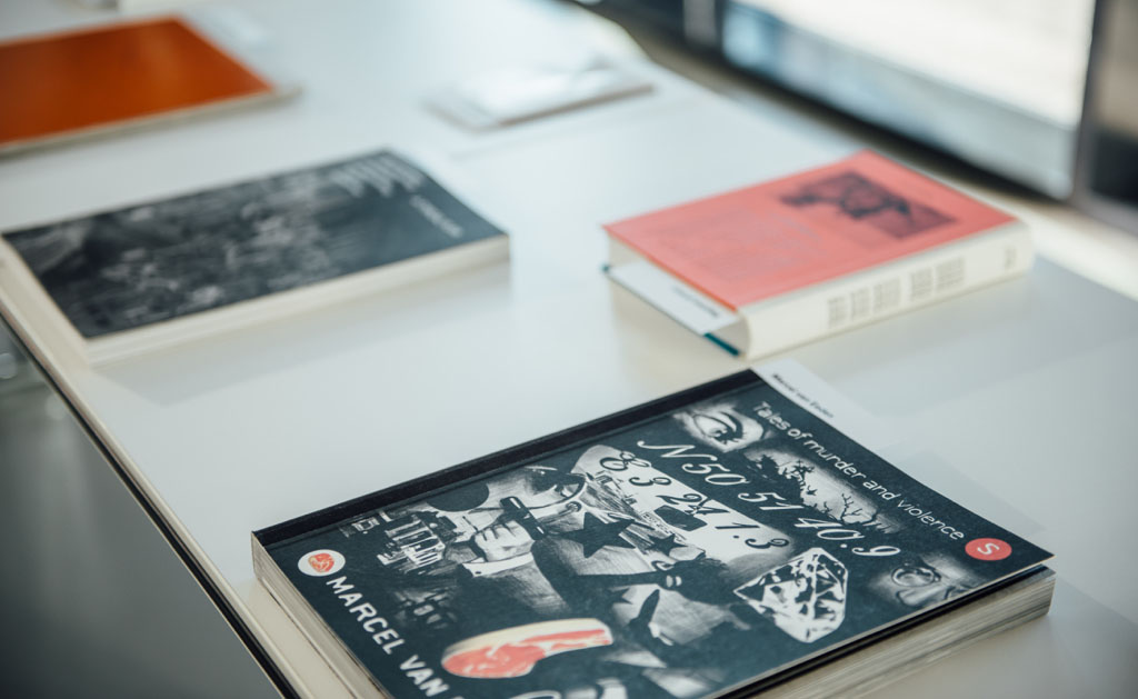
Marcel van Eeden
Dutch artist Marcel van Eeden uses Nero pencil and gouache to create sombre, often black-and-white images which loosely combine to form an extended narrative touching upon the themes of art, forgery and sex in the period from 1890 to 1965. For each exhibition he develops new plot lines, and the works have now been arranged in a large retrospective volume, for the first time giving one a sense of the progression of the overall story. The design is reminiscent of a graphic novel. Each double-page spread shows between 1 and 16 images, which are reproduced in four fixed formats. All images are set without space one next to the other and bled off at the edges, so there is no empty space, and the whole book consists of artwork - including the cover, endpapers and half-titles. A text booklet on very thin paper is inserted at the back. This unusual form of presentation for artwork responds perfectly to the material, and the extremely dense volume is challenging in a positive sense. The printing of the black tones is outstanding. Every detail of the volume's fabrication is precise and functional.

A sequence or phrase
The French artist Jean-Pascal Flavien constructs conceptual, abstract buildings that create the impression of being sculptures or pictograms, depending on the point of view chosen. Five of these works are presented here in a large-format, slim volume, each in one chapter with numerous photographs and sketches. In between them are theoretical essays on topics such as ‘building ...’, ‘there are ...’ and ‘a house... ‘, and all ten parts are directly accessible via a thumb index on the right edge of the book. The layouts vary in the size, density and arrangement of the illustrations, but the design convincingly takes advantage of the fact that Flavien's works have a graphic quality and in part function as figurative signs. The result is a form of visual discourse that makes no clear distinction between text and image. The intellect and the senses are addressed in equal measure.
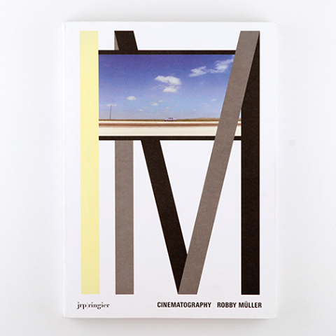
Cinematography
From 1963 to 2003, Dutch cinematographer Robby Müller participated in more than 70 films, working with, among others, Wim Wenders, Jim Jarmusch, Peter Bogdanovich and Lars von Trier. Numerous stills from 14 works are arranged here into various thematic but untitled chapters in a substantial volume with a softcover and flaps. Each chapter begins with an empty black page on the right and a white page on the left, followed by two to six stills per page, generally from one film or scene. They appear in two standard sizes and are arranged on a strict grid ; brief descriptive comments by the authors appear below most, but not all, of the images. While the layout is reminiscent of a photonovel, the relationship between image and text is rather peculiar. The closest comparison might be to a film with voice-over that has now been convincingly turned into a book. Thanks to generous use of white space, there is a surprisingly light feel to the contents. The cover design is audacious.
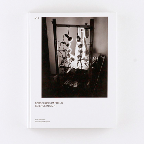
Forschung im Fokus
The third volume in the ‘Bilderwelten' series published by the ETH-Bibliothek in Zurich presents historic scientific photography from the fields of botany, glaciology, geology and meteorology since the end of the nineteenth century. An introductory essay with reference images is followed by the plates section, with over 150 photographs on coated paper. They are typically placed in a large format on a single page or on a double-page spread. The white margin varies depending on the format, but always leaves sufficient space for explanatory captions. The design is for the most part restrained, yet appropriate for presenting the imagery in an ideal manner. Thanks to careful photo selection, good sequencing and numerous surprising combinations, the result is a spectacular insight into a diverse pictorial world that ranges from microscopic to telescopic images.

Gestaltung der Grundlagen
In 18 chapters printed in red on white, this small-format handbook with a blue softcover and yellow dust jacket provides information on the preliminary design course (the ‘Propädeutikum') at the Zurich University of the Arts. The texts are interspersed with numerous single leaves showing a facsimile from historical textbooks on both the recto and verso sides. The chronologically arranged examples extend as far back as the sixteenth century and illustrate humorously - but not ironically - the immense possibilities in design and the flexibility of the given rules. This supports the accompanying texts, which argue in favour of a joyful questioning of authority, and the same attitude is also expressed in the entertaining design, which is full of variation and invention, particularly in the typography of the chapter titles. The small book is thus, in every respect, chock-full of ideas.
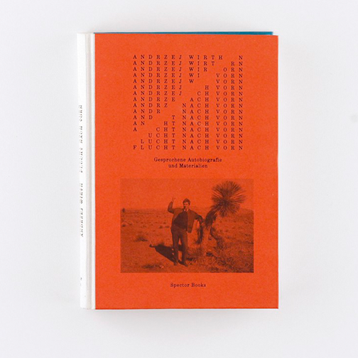
Flucht nach vorn
A ‘spoken autobiography’ by the distinguished Polish critic, theatre director and founder of the Institute for Applied Theatre Studies in Giessen, Andrzej Wirth (b. 1927), is presented as a thick reader with an eye-catching hardcover. The front cover is red, the back turquoise blue, and a gauze in a light tone has been used for the spine; all three elements are inscribed with black embossing. A single font in a standard size is used throughout the book, but the colour and arrangement vary widely. Wirth's statements are in red, the questions posed by his interlocutor Thomas Irmer are in turquoise blue, and ‘interruptions’ by Wirth are placed in between them, rotated by 90 degrees, in free arrangements with a great deal of white space. In the middle of the volume there are 15 essays by Wirth set in black type, with paragraph initials that are formed out of multiple small letters. The highly innovative typography creates a wonderful rhythm and an underlying scenography of articulation. The book's special material qualities and good binding also make it pleasant to handle and read.
.png)
THE TOUCH (Forbidden Pictures)
A slim black-and-white book with a hardcover documents an exhibition held in the crypt of the Grossmünster church in Zurich, for which Bruno Jakob ‘painted' black slate slabs with water. He gave the design team instructions for the ‘reproduction' of the work process, which are printed on the cover. Each slab was to be painted with water and then photographed several times as it dried. The result is ten predominantly black images with traces of water that gradually vanish, and which are presented individually in the first part of the book on recto pages. The second part contains short essays on the work, printed in single columns in white on black. The simple yet luxurious volume reproduces quite admirably the striking idea of the work, and the material is clearly organized. The precise fabrication of the binding and cover are worthy of special mention.
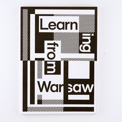
Learning from Warsaw
In a series of small exhibitions, readings and workshops that took place in Warsaw and were afterwards presented as an overview exhibition in Zurich, participants from Poland and Switzerland explored Warsaw's complex architectural identity. The large-format booklet has been produced using a special version of the Swiss brochure, leaving the simple wire binding of the text block visible. An introductory pictorial essay shows four-colour, mainly large-format photos that often meet directly in each gutter. This is followed by a long, black-and-white text and image section with ‘Lessons' by all of the project's participants. All of the double-page spreads are framed with printers' marks on the left, right and bottom margins, explained by the fact that the booklet is the result of double folding of the uncut standard printed sheets. The various design decisions are both independent-minded and consistent and create a rough, industrial overall impression. The pictorial essay is deftly edited and the jacket is very bold.
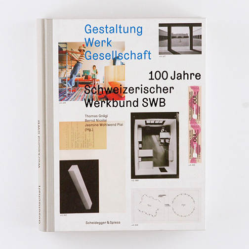
Gestaltung Werk Gesellschaft
This centenary volume is the result of a research project financed by the Swiss National Science Foundation. Six thematically organized sections, with a total of 70 chapters written by 20 authors, create a comprehensive and richly illustrated presentation of the institution and its activities. Combinations of image and text appear on the majority of the double-page spreads, with some exclusively featuring images or text. The designs treats every spread in an individual and relaxed manner, yet a connecting thread remains visible and everything is executed with great precision. Particular care is taken with the image combinations which, taking their colours into account and with a generous use of white space, give rise to elegant groupings. At no point does the wealth of material presented become overwhelming.
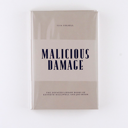
Malicious Damage
Around 1960, the British playwright Joe Orton and his partner Kenneth Halliwell stole countless books from London libraries ; the pair would alter the covers with surreal collages - often of homosexual content - and then return them. This volume with a hardcover and a strikingly pleated clear plastic dust jacket documents the story through essays, photos and a selection of the collages. The book begins with a fold-out police photo of Orton and Halliwell's flat, the walls completely covered in cut-out pictures. It is a successful introduction to the theme and the whole book is very well structured. The grey paper used for the text sections recalls the contemporary newspaper coverage of the case and the dust jacket is reminiscent of libraries. Several design details seem a little crazy or even bizarre, but it all matches the unusual content.

„Meret Oppenheim. Worte nicht in giftige Buchstaben einwickeln“
The book received the Golden Letter - the highest award - in the Best Book Design from all over the World competition (Stiftung Buchkunst, Frankfurt).
Nearly 30 years after Meret Oppenheim's death, selections from her correspondence have been published for the first time. The comprehensive volume with a softcover groups together substantial excerpts of letters exchanged with 34 correspondents. Within each correspondence the letters follow one after the other without interruption in a two-column layout, so most of the pages are well filled. Between the pages of text are numerous single sheets in different colours that feature the fronts and backs of one to three facsimiles. The simple structure and elegant execution make for a superb presentation of the wealth of material. Without glorifying Oppenheim, the book serves as a guide to her world and can be explored at leisure. The typography is in perfect accord with the letter genre and is virtuoso in every detail. The cover has a very seductive quality.
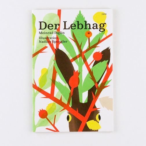
Der Lebhag
The Schweizerische Jugendschriftenwerk (SJW, Swiss Organization for Young People's Literature) has republished Meinrad Inglin's story ‘Der Lebhag' (The Living Hedge). In this slim volume, the text is set in one column in a relatively large font, interrupted by numerous pages with two to four drawings by the designer on each that illustrate particular terms from the surrounding text : animals, plants, objects, etc. The drawings are composed of paper cut-outs scanned and digitally manipulated to form collages. In the middle of the volume, the eponymous ‘living hedge' and its inhabitants can be seen in a full-bleed double-page spread, and the jacket also features the hedge over two pages. The designer makes the most of the traditional format of SJW books. The illustrations are both particular and beautiful, and are well matched by the chosen font and meticulous typesetting. The overall impression is clear, open and communicative.
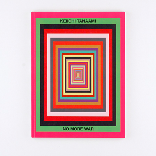
No More War
A large-format catalogue with a softcover and glossy paper presents some 40 wood-carved and colourfully painted sculptures made by the Japanese Pop artist Keiichi Tanaami between 1977 and 1993. Each double-page spread features two objective photographs of one sculpture against a white background, placed in a repetitive layout either side by side or one above the other. The page backgrounds are in varying, expressive colours and function as monochrome picture frames for the photos. On the cover, these ‘frames’ are all placed one inside the other in decreasing sizes, creating a visual table of contents. Although the coloured pages are practically a theme unto themselves, they remain functional, as they provide the sculptures support and subtly reference the colours to be found within them. The limited typography in the appendix is simple and makes a strong impression. Overall, the design seems a bit trendy but is appropriate for the work.
.png)
WIR SPIELEN (WE PLAY)
The Berlin activist group WIR SPIELEN wrote a theatrical drama on the issue of community-building based on Mary Ellen Solt's ‘The Peoplemover : A Demonstration Poem' (1968). The five-act play, largely consisting - just like Solt's poem - of quotations, is published, together with its source, in a black-and-white text volume with a discreetly coloured jacket featuring four special colours that reference posters made by Solt. The type is in a single font and a standard size throughout, and the page layouts play across three columns : short lines on the left provide rhythm to the main body of the text, individual words or phrases are set in the middle column, and the sources of the quotations appear on the right. The extremely radical and innovative design recalls Concrete poetry and emphasizes the pictorial quality of type, while actual pictures are entirely absent. Despite the reduced means and large number of pages, there is no feeling of repetitiveness and the book makes an inviting impression.

Pierre Schwerzmann
A catalogue with a hardcover available in four different monochrome versions presents Pierre Schwerzmann's abstract paintings, which feature simple geometric shapes and painterly blurring. The works are reproduced in full bleed on single or double pages, and in some cases have been cropped to fit the format of the book. The abstract forms almost appear to be elements of book design, especially in those images with a white background indistinguishable from the background of the book page. Between the full-bleed reproductions of the works are exhibition views and several essays in a slightly smaller paper size, so that the still-visible parts of the preceding or subsequent works serve as frames. The combinations of room views and surfaces at times creates a dizzying impression, and thus it is fitting that the essays are set in slanting columns. The changing scenography remains exciting throughout, and the volume possesses a remarkable visual coherence.
Follow our news on our page! (sorry, in Lithuanian only)
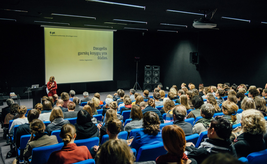
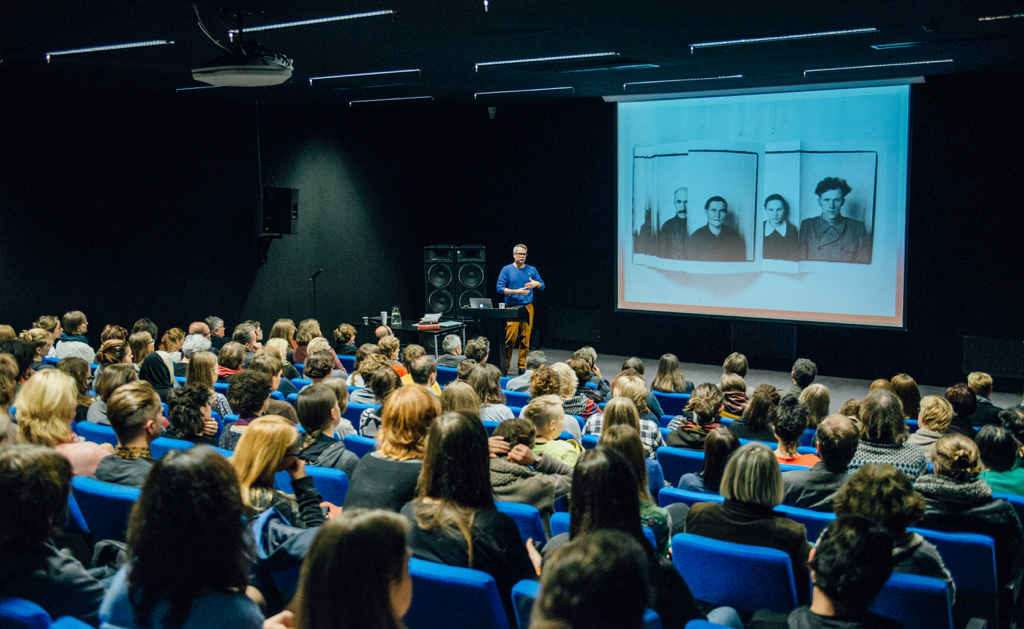
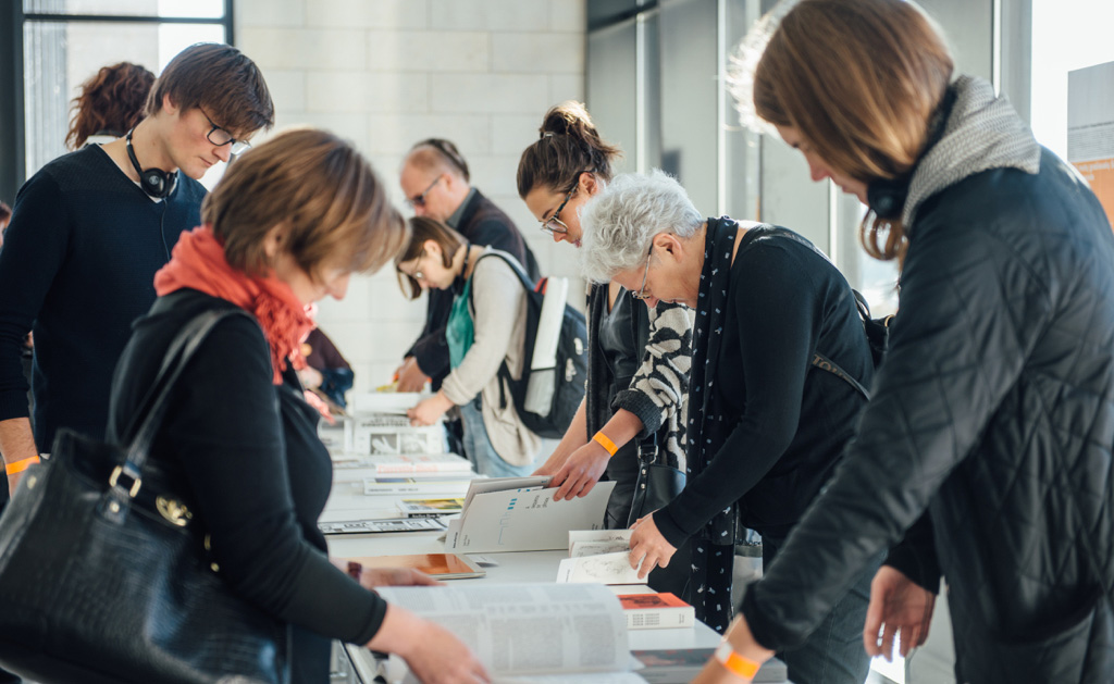
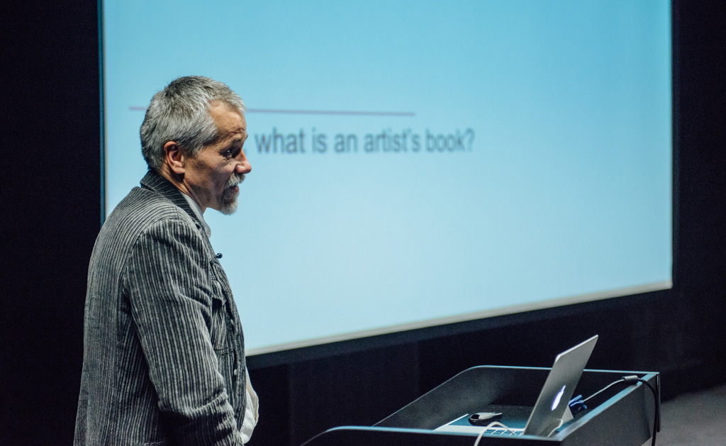
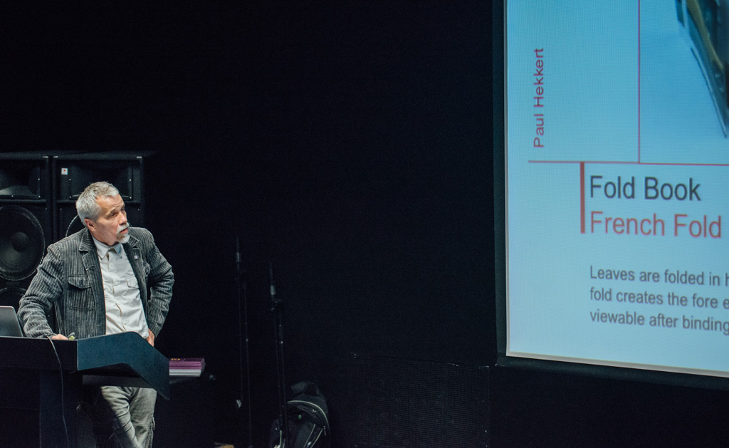
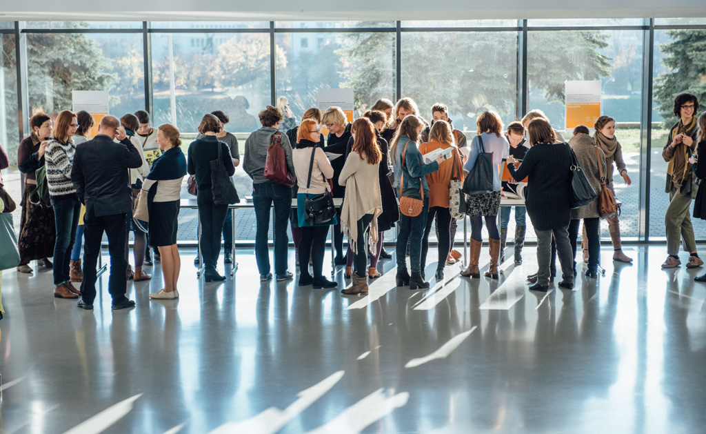
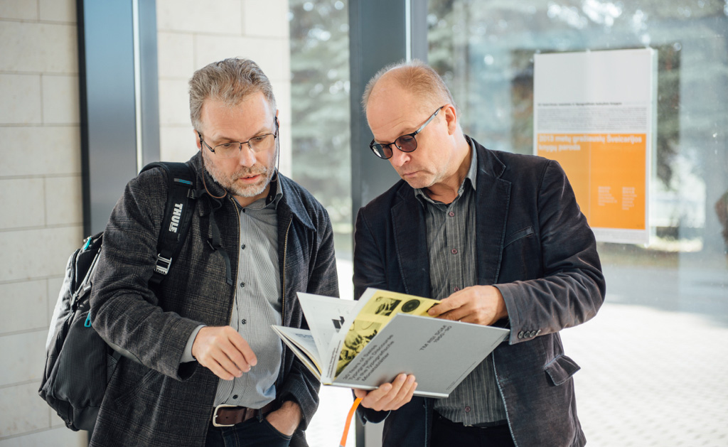
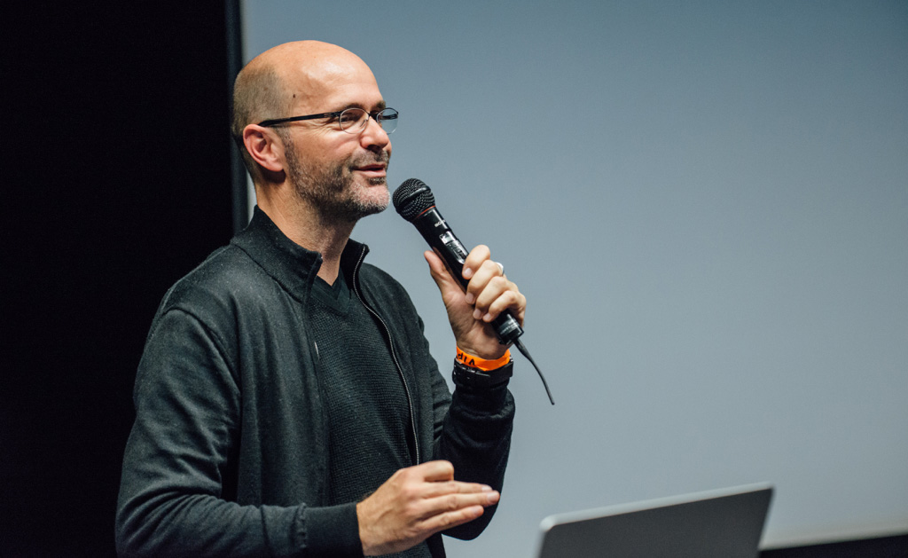
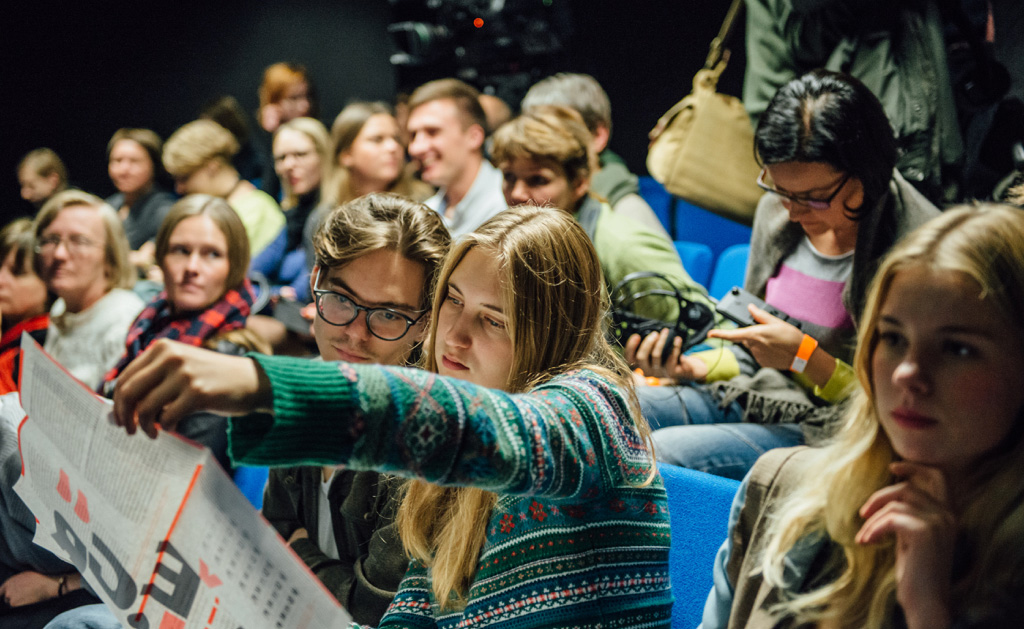
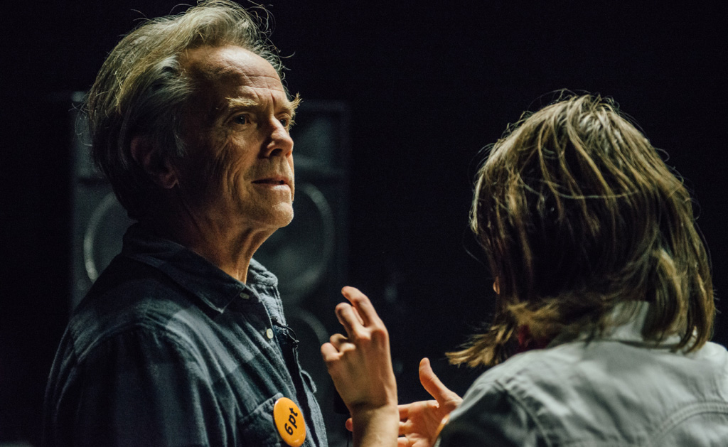
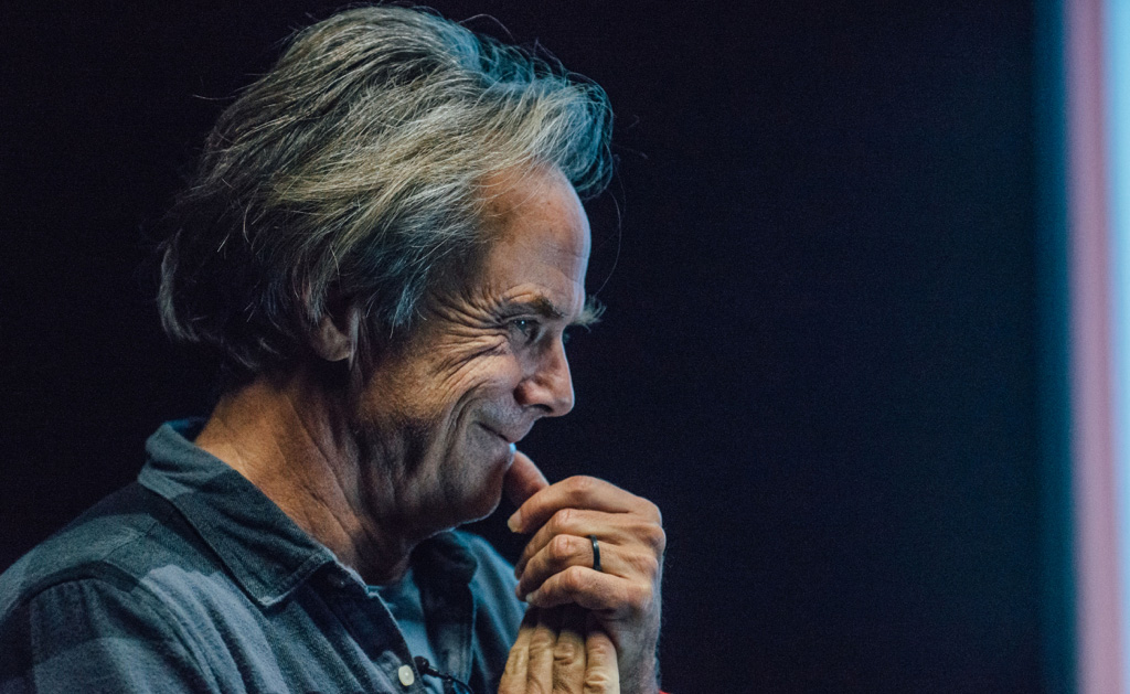
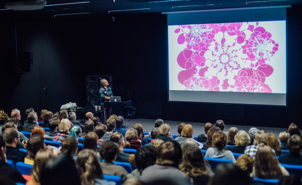
Moments of the conference
Cinematographers:Povilas Baltinas and Giedrius Ilgūnas
Photographer: Mantas Puida

